There are moments when a color seems to speak for itself. You see it on your phone screen, or on your computer monitor, and you feel certain you understand it. You already imagine it knitted, or transformed into a finished piece—perhaps a scarf or a sweater. In that moment, the color feels real. Or at least, it seems that way.
Then the yarn arrives.
You open the package, you look at it under natural light… and something shifts. It’s not completely different, but it’s not exactly what you saw either. Warmer, cooler, deeper, or slightly more muted. And that’s when the question arises: where is the truth? On the screen, or in reality?
The answer is simple, yet often overlooked: the color you see on a screen is never an absolute truth.
Every device—phone, tablet, computer—interprets colors in its own way. This happens because each screen has its own calibration, often automatic, often designed to “look better” to the human eye rather than to be truly accurate. Some displays enhance contrast, others boost saturation, while others lean toward cooler or warmer tones. And in most cases, these settings are not even visible or controllable by the user.
Two people, looking at the exact same image at the same time, may see slightly different colors. And most likely, neither of them is seeing the true color.
There is also another factor, often ignored: ambient light. Looking at a color under the warm light of a household bulb is not the same as seeing it under natural daylight. Our brain constantly compensates for these variations, but the screen does not. And so, the result changes once again.
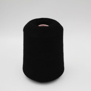
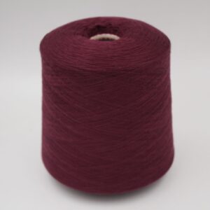
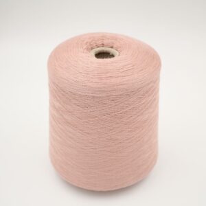
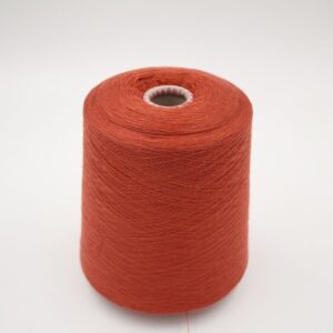
This is why, when we photograph our yarns, we always start from a precise, controlled reference point. All the product images on florencecashmereyarn.com are created using a 5500 Kelvin light source, which corresponds to neutral light—the closest possible to natural daylight. This is not a random choice, but a technical standard used to ensure the highest possible color accuracy.
Not only that. The photos are also white-balanced at 5500K, removing unwanted color casts and creating a neutral and consistent color base. This means that, from a photographic standpoint, the yarn color is captured as accurately as possible. In other words, it is the most reliable starting point we can offer.
But from that moment on, the color passes through the filter of your screen.
And that is exactly where the gap between what is and what appears begins.
A blue may look more vivid on an OLED display. A beige may appear warmer on an uncalibrated monitor. A gray might shift toward green or purple, depending on the screen’s color temperature. These are subtle differences, often minimal, but in the world of yarn—where color choice is essential—they can make the difference between a project that works and one that never fully convinces.
For this reason, there is one simple rule we always recommend: trust the color name.
It may sound obvious, but it is not. The color name is the only element that does not pass through any digital filter, any screen interpretation, or any lighting variation. It is the most stable, concrete, and reliable reference.
If you read “medium gray,” “warm beige,” “navy blue,” or “forest green,” that is your true starting point. The photograph is there to support you, to help you imagine, but it cannot fully replace the physical reality of the color.
This does not mean that images are not important—quite the opposite. They are essential. But they should be understood for what they are: the most accurate possible representation, created with care, technical precision, and professional tools… which still has to pass through your screen before reaching your eyes.
And in that passage, something can change.
Understanding this process means avoiding misunderstandings, but more importantly, it means making more conscious choices. It means knowing that behind every color there is a physical, tangible reality that no display can ever reproduce 100%.
The real color is the one you touch, the one you work with, the one you transform.
What you see on the screen is only an interpretation.
And like all interpretations, it must be read with the right awareness.


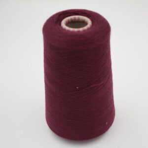
 PRESTIGE 100% Merino Extrafine nm 2/60 color bordeaux cones 540gr Original price was: €39,53.€26,35Current price is: €26,35.